
Study for Sheldon's Church
I've been working on a series of computer manipulate photos that I am printing on fabric. Sheldon's Church is one of these images. I decided to print a small image (13" X 17") that had a slightly different design to see how I wanted to quilt the finished piece.

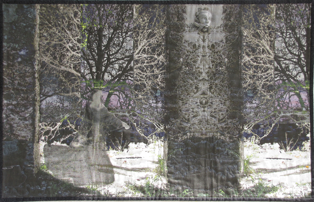
Ghost of Sheldon's Church
This is the original idea but after I did the study, I felt that I liked it better. Ghost seemed to be a bit to symmetrical. In the mean time I decided to enter Study for Sheldon's Church in the ITAB International TECHstyle Art Exhibit. I received a thank you but no thank you reply to that exhibit. Ususally, I don't question my pieces even when they have been rejected from an exhibit but I have had questions about this whole thing from the beginning.

I took both the pieces to my Focus meeting and as I was showing them I just placed the small one over the larger piece. I was about to take it down when I stepped in front of the design wall to look at the two together and it flashed through my mind that "this doesn't look too bad". I was also beginning to get vibes from many of the group that there was happening between the two pieces.
Am I just looking for a way to salvage these pieces or should I just chalk it up to experience?
Any comments would be appreciated.
I really like the little one placed over the small one. Makes the whole thing look mysterious and interesting.
ReplyDeleteLora, thanks for the comment. Mysterious, ghostly is what I was going for.
DeleteI love them together! Yet, I wouldn't make this decision because of a rejection but only if YOU really like them together.
ReplyDeleteSusan, My decision would not be because of rejection, if that were the case I would have many reworked pieces, I was never happy with it from the start.
DeleteI think the overlap is more interesting as well. The symmetry is broken up and the size difference is more interesting. SAQA has a critique group on SAQA-U that members can join. It's online, and very helpful.
ReplyDeleteJeanne, I did not know that SAQA-U had a critique group. I'm afraid that I haven't checked out all the good things that SAQA provides. I will check it out.
DeleteAs I said in my post the symmetry bothered me as well.
I find them more intriguing when placed together. Try moving the small one all over the large one to get a feel for 'correct to you' placement. I agree with Susan, though, only overlap if that's what speaks more loudly to you.
ReplyDeleteThanks Kathy, That should be easy enough to do. It does speak to me, now to find the right location for the best design.
Delete