This beautiful girl to the left is one of my granddaughters. I was lucky enough during the Easter holidays to be with her and get some much needed new photos.
In this post I am going to show the steps to this process and explain just a little how this is done.
This is not quite the finished product as it has not been pressed. I also am going to add a few more things when I get time. Looks like her doesn't it?
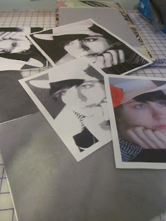
The first step is to do some computer manipulation in PSE to create a posterization. This gives you the pattern you will follow.

Here I have selected the four value shades of light gray/dark gray. It looks like I have covered some of the fabric up, but you get the idea.
Cutting out layer one. Isn't it amazing how much of this images comes up with just two values of fabric?
Cutting layer two. Here I have added the third layer of value. It's coming together isn't it?
Cutting layer four. You may notice that I am only talking about cutting three layers. The first layer acts as the base for the image and you actually begin cutting on layer two. A bit complicated for this post, but not difficult to understand in class.
Just about finished. I have a few things I need to do to this layer before I press all the layers together.
This is such a fun technique to do, the students are always excited with the end results. In a few weeks I will have some student images to share.
www.ninamariesayre.blogspot.com This post is linked to Nina Marie's Off The Wall Fridays
I really wanted to get this done before I posted so I spent more time in the studio tonight than normal. Wanted to try the rose in red. What do you think? Shades of gray or red?


Ohhh your granddaughter is lovely. I just showed Tessa and I said - Hey could I do a portrait of you? and she agreed. Thanks for the inspiration and continued good luck with teaching!
ReplyDeleteThanks Nina Marie. I look forward to seeing your daughter's portrait.
DeleteBeautiful! Thanks for sharing your process. My vote is for shades of gray.
ReplyDeleteThanks Heather, so far you are in the minority. Most everyone likes the red. I think it is a bit bold, if I leave it I think I will subdue it a little.
DeleteYou nailed it...it's wonderful
ReplyDeleteLovely and inspiring! Thanks for sharing!
ReplyDeleteThanks you and your are most welcome.
Deletejust breath taking. you did a lovely job. How do you cut the layers? with scissors?
ReplyDeleteYes I do use scissors. Very small sharp scissors.
DeleteIt's beautiful. Thanks for describing the technique! I love the rose in red- the pop of color in an otherwise monochromatic piece draws the eye.
ReplyDeleteThanks Shannon. I like the red as well.
DeleteWonderful tutorial and art piece. I'd love to have you share it on my Design Wall Weekend blog party at http://fiberartistjourney.blogspot.com/
ReplyDeleteThanks Christina, I would be happy to share but don't have the time to figure it out this weekend. You are free to publish it if you wish. I'll try to find time soon to hook up to your blog.
DeleteI am not a big fan of people portraits in fiber, as most of them turn out looking too creepy. But yours looks very natural. Good job.
ReplyDeleteThanks Judy. I seem to have an obsession of recreating people in my work.
DeleteLovely granddaughter! I like the rose in red. Thanks for describing the technique.
ReplyDeleteThanks Sylvia, she is lovely in many ways. I am always happy to share.
DeleteI love it, Marilyn, and I like the gray scale with the touch of red. I also love "A is for Audrey" from the last post. Lucky you to have such beautiful grandchildren for models and lucky them to have a grandma like you to portray them so splendidly.
ReplyDeleteThanks Norma. I love doing portraits of people I love. I am lucky to have such beautiful and handsome grandchildren.
DeleteI think shades of grey. For me the red is too much of a distraction from the face.
ReplyDeleteWhat was your reaction when you saw the 2 photos - w/red and w/out red - when you had them on your computer? Sometimes that helps me. or put them side by side to think on a while.
Sandy in the UK
Thanks Sandy, I will try what you suggested and see what I like the best. Right now I'm looking at toning down the red and leaving it.
DeleteGood portrait!
ReplyDelete